Accessibility Services Office
A service and website redesign for the accessibility services office at the University of Toronto

For this project, we were approached by the accessibility services office at UofT to help them improve the efficiency of their service and increase user satisfaction.
I was one of the UX researchers for this project that had to research the problem and come up with a solution. I was also the lead designer for the project where I had to redesign the website.
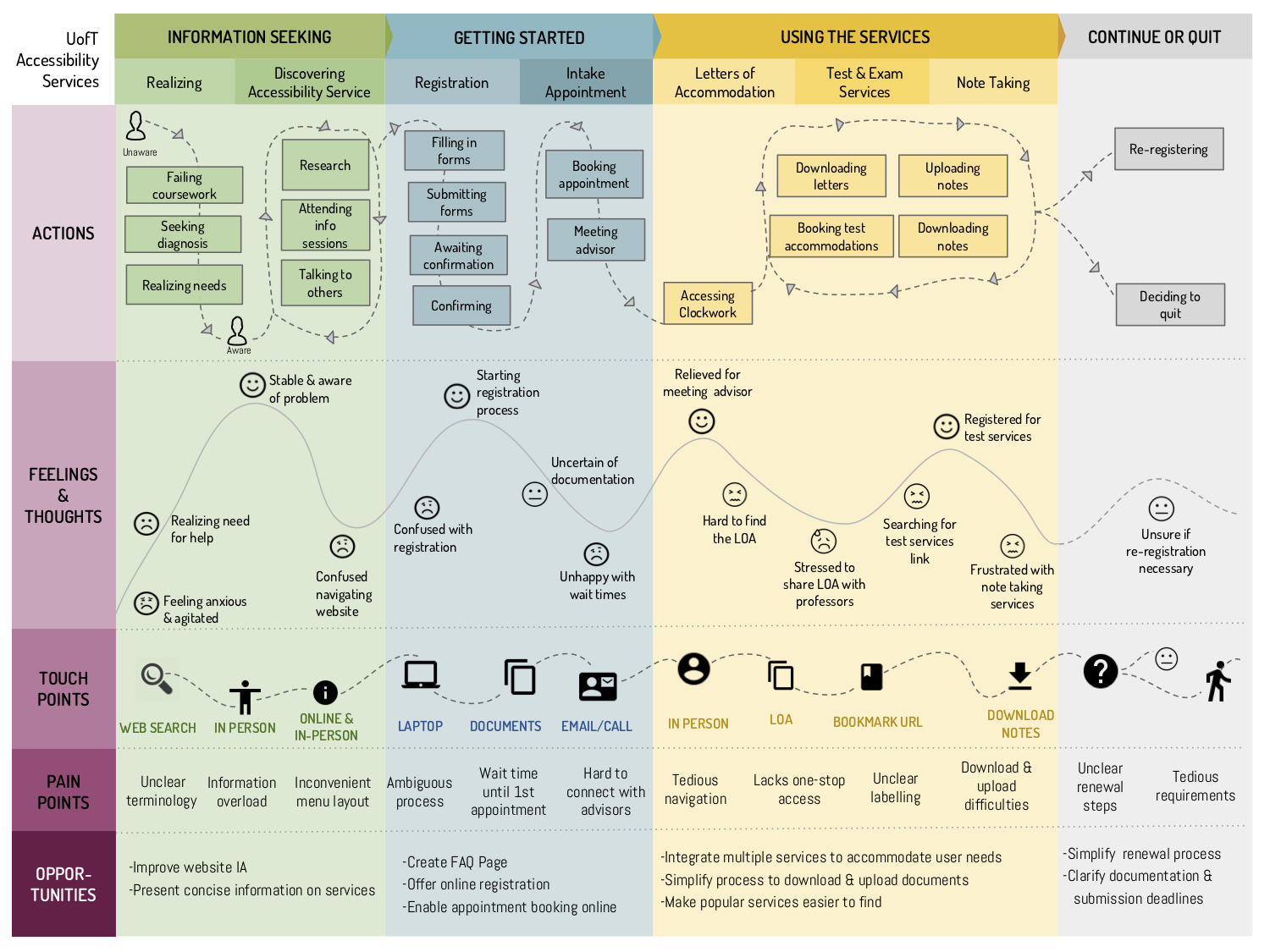
First to help us identify the problems and highlight the areas for improvements in their services we decided to build a user journey map to outline the whole process that the user goes through when using their services: what actions do they take, how do they feel about it, and what products do they use. The map was presented to the Accessibility office with a list of suggested improvements for their services and how it is organised.
From the map, we realized that their website was not serving its purpose so we decided to revamp their website. Through our research, we realized that the content on their website was not easy to understand or follow and the information was difficult to find. So the redesign of the website focused on two aspects: the content and the information architecture of the website. We used card sorting where users had to match content and their titles to help reorganise the content in a way that made sense to the target users.
To measure the effectiveness of the redesign and improve on it we did a user testing where we gave users a list of tasks to complete on the original website and the redesigned one.